Archive for February, 2012

A Little Reminder

Hey friends! Just wanted to remind you that Google Friend Connect is being terminated here soon! Here are a few options to continue following along…..

HOW TO STAY IN TOUCH:

1. At the top left hand corner of my blog you will seeclick on that and you can follow along in your preferred reader ex: Google+

2. Scroll Down to the bottom of my blog and you will see the following choices:

~ follow along via the NEW Linky Followers

~ follow along on

~ follow along on

~ follow along on Bloglovin

I’m VERY busy working on my Master Bedroom right now. We are slightly hung up with the whole molding thing but I plan to start creating my upholstered headboard soon. I still haven’t decided what shape to use, there are so many options!

{source}

Any votes? Which style do you like the best?

Picking Paint: The Color Wheel

This post probably should have been done at the very beginning of this series but hey I’m saving the best for last! If you need tips on how to choose and coordinate colors in your room, or  rooms that join together, this should be helpful. The color wheel can be very in depth so I’m going to try to give you a brief rundown that covers the key points.

The Color Wheel

There are 12 colors in a standard color wheel that are broken down into three designations – primary, secondary, and tertiary.
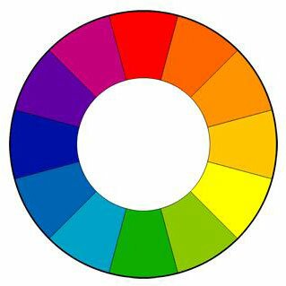
~ Primary Colors – red, blue, and yellow

~ Secondary Colors – a combination of two primary colors.

  • - red + yellow = orange
  • - yellow + blue = green
  • - blue + red = violet

~ Tertiary Colors – a combination of a primary and a secondary color.

  • - red/orange
  • - yellow/orange
  • - yellow/green
  • - blue/green
  • - red/violet

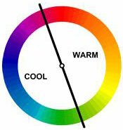
~ Warm Colors – Oranges, reds, and yellows. These colors create an intimate cozy room. They make a space feel condensed so be careful when using them in smaller rooms.

~ Cool Colors – Greens, blues, and violets. These are soothing colors and will make your room feel larger.
~ Tint – when you add white to a color.

~ Shade – when you add black to a color.

Color Schemes

Color schemes are based on the color wheel and can be used as a guideline when selecting colors for a room. Using one of the four color schemes will give you a pulled together look. There are several variations and different color schemes. To keep things simple I’ve picked the ones that I prefer.

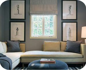
~ Monochromatic – Uses only one color with different shades and tints. It’s generally a good idea to use a lighter shade on your walls and use the darker shades for your accessories. To tone things down a bit add in some neutrals (whites, creams, greys, or browns).
{}

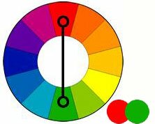
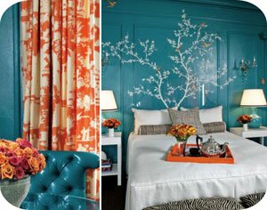
~ Complementary – Uses two colors that are opposite on the color wheel. This creates a very vibrant look especially if the colors are used in their full saturation. Be careful using two colors of the same intensity, you don’t want to create a room that is jarring. Complementary colors work well when you want something to stand out but are very tricky to use in large doses.

  • red and green
  • blue and orange
  • purple and yellow

{}

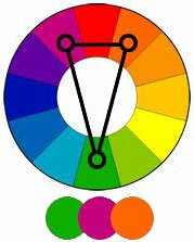
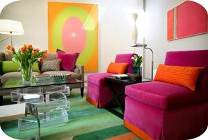
~ Split Complementary – A variation of the Complementary color scheme. It uses a base color and the the two colors adjacent to its complement. This scheme offers the same contrast as the Complementary but with less tension. This is a great choice for beginners because its tough to mess up.
{}

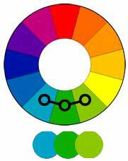
~ Analogous/Harmonious – Uses colors that are next to each other on the color wheel to create a comfortable and serene look. These colors match well and are easy on the eyes. This color scheme works best if you choose colors that are either on the warm side of the color wheel or the cool. This is one of my favorite schemes to follow.
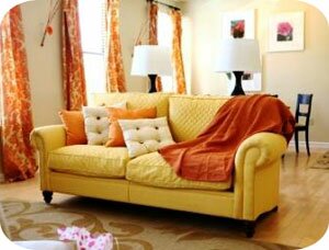
{source}

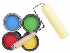
~ Triad – Uses colors that are evenly spaced around the color wheel. Just like the complementary color scheme, these can be very overpowering when used in their full intensities. Choose a main color and use the other two in small doses as accents.
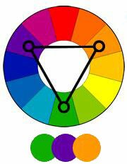
A triad scheme of blue, yellow, and red is another great example
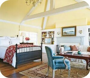
{source}

 When using all of these schemes its important to factor in texture. Textures can change the entire feel of your room and really pull everything together. If you feel like something is missing re-evaluate the amount of texture you have used in the room and add more if necessary.

If you have adjoining rooms follow these steps: pick a color from one of the rooms, choose which color scheme you want to follow, and use it’s flow. Remember, you can use different intensities and shades of any hue.

Phew that was a lot of color talk! So, what’s your favorite scheme?

Make sure you check out my other posts on Picking Paint!

linking up with these great bloggers

*color wheel images

Picking Paint: Finishes

Finishes

Today I will give you the 411 on paint finishes, also known as the sheen or gloss. A paints gloss or sheen affects how durable and reflective it is. At one end you will have your “Matte” finishes  (also known as “flat”) which reflect very little light. At the other end you have your “Gloss” finishes which reflect a large amount of light.

{}

Let’s go over each finish and the “common rules” to using them:

~ Matte/Flatt – The least glossy of all finishes with a non-reflective and porous surface.

  • They have a smooth/dull appearance which makes them good at hiding surface and application imperfections (such as brush strokes).
  • Susceptible to moisture damage, scuff marks, and stains.
  • It’s surface doesn’t hold up well to cleaning products and scrubbing.
  • Uses: Commonly used on walls in low traffic rooms and on ceilings.
  • Avoid: Usage in any room with moisture (bathrooms, kitchen, laundry rooms), kids rooms, high traffic areas and trim.

~ Eggshell – The most widely used finish.

  • It has a slight sheen to it which makes it more durable and easier to clean than the Matte finish.
  • Uses: Considered a well rounded finish that offers durability without to much sheen. Appropriate to use on all interior walls.
  • Avoid: It’s still wise to use a sheen with a higher gloss in areas with high traffic or susceptibility to vigorous or frequent cleaning.

~ Satin – Is similar to eggshell in that it is used frequently because of its durability and moderate sheen.

  • Satin tends to be slightly glossier than eggshell but in some brands you might notice that it is nearly the same.
  • Uses: A well rounded finish that is typically used in kid’s rooms, kitchens, bathrooms, and on trim.
  • Avoid: Is appropriate for most applications but some might prefer the less glossy eggshell or a glossier finish for high traffic areas and trim.

~ Semi Gloss – Offers more durability than Matte, Eggshell, and Satin finishes.

  • Typically considered to0 glossy for general application
  • Uses: If used at all, its typically in areas that might require vigorous cleaning, or be exposed to moisture and heavy traffic. Kitchens, bathrooms, and laundry rooms.
  • Avoid: Too much gloss reveals surface imperfections and can give the walls an uneven color appearance. Typically not used outside of the kitchen or bathroom.

~ Glossy – The least used of all finishes. It is used so rarely in interior painting that some brands don’t even carry an interior gloss.

  • Extremely durable, stain resistant, and will dry to a laminated look.
  • Uses: None, sometimes used on trim or cabinets.
  • Avoid: Usually not used for interior painting.

A single color used in your room takes on a new appearance when applied in different finishes. For example, if you use an Eggshell finish on your walls and a Semi Gloss finish on your trim, the color will appear slightly different. It creates a crisp, clean look in your room.

  I hope you’ve enjoyed the series! I’ve decided to go over one more element tomorrow, the Color Wheel. This is a great topic that will help you understand how to use and blend more than one color in a room and in your home. Happy Friday!

If you missed the other posts on my Picking Paint series you can go here.

Picking Paint: Testing Your Color

Yesterday I touched on lighting and how it effects the appearance of your paint; these two topics sort of go hand in hand. The most important step in choosing the right paint color is to test your options. This is also a good time for you to experiment and step out of your comfort zone. If you typically stick with neutral hues try experimenting with a little color!

{}

Now that you have picked out a few colors you can purchase sample paint. Valspar and Behr both offer paint samples for about $2.94.

There are two really good options on how to display, visualize, and use your samples.

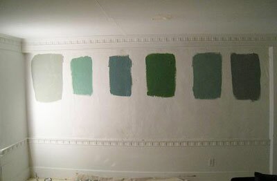
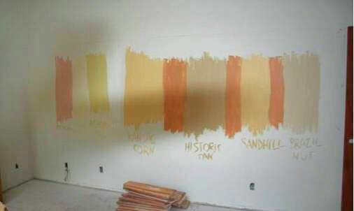
Your first option is to paint big sections on your wall in each of the colors that you are considering. Make sure you find a way to keep track of each color. You will want to have a sample section that is big enough for you to get the “feel” for the actual color. It’s also important to make sure that you get a good even coat. You might have to do two coats if its necessary; you really want good coverage to achieve the true color.

{}

DON’T:

Paint your sections too close together. The colors will start to blend together and it will make your decision even harder. You want them to have good spacing so they don’t interfere with each other.

{}

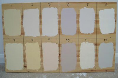
If you aren’t a fan of painting the samples on your wall you can use a piece of MDF or poster board. This is an effective way to sample different varieties of colors. I still prefer to paint them directly on your wall if you can.

{}

Leave your samples up for a few days. There will be a few that you will automatically rule out and others that you might be unsure of. This is where the lighting portion comes in. Make sure that you look at your samples in all three of the different lights; each hue might appear slightly different depending on the light. After you have examined and studied your samples for a few days you should be ready to make the big decision!

Make sure you check out my other posts on Picking Paint

Linking up with these great bloggers